Showing posts with label Robert Buler. Show all posts
Showing posts with label Robert Buler. Show all posts
Sunday, 29 January 2012

Saturday, 28 January 2012
Evaluation Q4
We've recorded our cinema screening to show you how people reacted after watching video :) The reaction was very positive, some people were giving standing applause, some cheerful screaming from girls as well. However, most people already saw our video during editing time, so the reaction could be "little" overreacted! :P
The feedback we've received after cinema screening was not only very helpful, but also interesting part for our evaluation. We had a chance to know what other people think of our music video, what are their reactions and what made the biggest impression on them. I think that we all felt really proud when people were giving positive feedback!
We asked not only for teacher's opinion, but also students and media technicians. Large age range is very important, as teenagers might be attracted to different aspect as grown ups :)
Eleni said some very helpful stuff about our music video. She said that projector screening was made our video very energetic, and she was really attracted to bright colours. Also, different range of stories made our video interesting to watch. I'm pleased that colours made an impression on her, especially that colourful video was a main point to make teenagers attracted to Mic CTRL.
Dan - our teacher - said that our video was successful because it was fun. For me, it is good to know that stupid dancing in front of camera payed off. Even through projector "covered my face", my performance was so entertaining he didn't pay much attention to it. That was a really interesting comment, as I learned that not everything must be perfectly recorded to look outstanding. Also, now I'm quite sure that our video would be terrible without projector screening. Well, maybe not terrible, but surely boring.
He commented my "out of sync" singing, and said there is one shot that we could've change. We've found this problem while editing, however, somehow, I messed up on every single base track in this moment! Well, those things unfortunately happens and I learned my lesson to be prepared, and make sure you watch every single base track before leaving recording area...
Micky - our technician - just like Dan was very pleased with projector screening. He said that it was very entertaining and fun to watch. I'm glad to hear so many positives about my performance, especially from people how really know what they're talking about and have years of experience. I realised that not only teens find my dancing entertaining, and adults also like the colours combined with weird dancing ;)
An addition, when we were editing our video I frequently asked Micky for his opinion. Once, Tony and Micky were arguing about the skateboarding part. Micky was saying that it should be black&white to make greater contrast, especially because most skateboarding clips were cutting to really colourful art room. Tony was against this idea, however now he claims that Micky might've been right. Conclusion? Do not listen to Tony :D
No, but seriously, I've learned that sometimes it's good to make a balance between colours and dark. I might have even greater effect after all! But well, we'll not be able to check who was right.
Konrad - 17yr old student - He was really impressed with editing and he really enjoyed effects we applied. That's good, I'm glad many hours of editing were worth it. We even came on Saturday to edit for 7 hours! :) I've learned that people from our target audience enjoyed fast editing, as well as combination of different lightings used (as Konrad said). Teenagers often pay most attention to editing, and less to Mise en scene. I think this this applies to Konrad as well!

He also gave me a review about my digipak. He spotted that vibrant colours represent the genre and my digipak has connection with video we've created. This is very important, as people watching Mic CTRL's music video could easily spot his CD in HMV. Also, my digipak's font is connected with 70/80's disco typography.
He also spotted the hat I was wearing in music video is visible on CD. What that means, people do recognize certain symbols and signatures once you'll show them few times. My hat was outstanding (even through it cost 2.5pounds in Primark =) ) and if singer wants to be successful in those times, he must have something that nobody else has.
On advert, he also spotted that the background is very colourful and connected with my video+CD cover. It means that repeating few items or scenery throughout whole project is very important to new artist, as he will be automatically connected with them. He also likes that I've used logos of social networks and QR code to connect with my target audience. That is true. Teens often use internet to connect with artists, so having a facebook account or QR code that will redirect them to my website is crucial. To be successful, you must know your audience better than they know themselves!
Evaluation - Question 3
Question 3: "How did you use media technologies in the construction and research, planning and evaluation stages?"
I have created the "Prezi" to show you how I used different technologies.


I also made a quick tutorial showing how to use "razor blade" and cut a part of a clip you want to.
Here is a video of our pitch we've made, which is also showing our digital storyboard.
A lot of things changed over the time. Most aspect were cutted/changed, recording places were completely different, however our teachers had a better idea what are we going to do. And this was the main purpose of pitch :)
EVALUATION Q1
Our music video is connected with Dance/Electro Pop genre. An artist we've created - Mic CTRL - is a "combination" of techno/dance/dubstep stars as Calvin Harris, Example, Olly Murs. They've influenced us at the beginning when we started to think about genre and music videos. What we liked about them was a colourful and fun style, just what we could expect from Electro pop!
Our music video follows conventions of Carol Vernallis's theory. Music videos of different genres have the same/similar aspects as ours, and that makes our music video better and more energetic.
- Master shot/base track - we used five different base tracks to make our video more energetic by quickly changing the shots. The cut must've been done on the beat, so that video is more "in sync" with music.
-Jump cuts - We used them in purpose to shorten our clips and make our video much more striking, interesting and exciting to watch. This is a way to show a lot in less time. Probably nobody wants to watch a boring movie, where nothing is happening, especially in fast and energetic songs like ours. Instead of showing a whole clip that can last few minutes, we could cut unneccesary scenes and shorten to few seconds. A lot of quick still shots make it look like like GIF. Colours are very bright and surely are very eye catching. Also, the movement and cups changing places look exciting to a viewer.
Important thing I've done over the whole music video is eye contact with viewer. I often look at the camera, which makes me also a narrator. Also, I think that audience was "a part of a music video", what Goodwin states as a important aspect. Whenever I look at our video, I feel really happy about the connection I'm making with me (in this case :) ). Also, I did some really stupid things in front of camera. Dancing like an idiot and giving "mega weird" faces was actually very useful and payed out. Energetic performance surely made audience happy and created a lot of laugh across the cinema.

Our teacher, Rebecca, realised that when I sing" I feel so close to you right now...", there is a transition to Evie. She told us that we created a love connection by mistake. This is something we haven't realised at all, but she might be right. I don't think it's a problem, because everyone has their own mind and everyone can see something else.

Olly Murs' song "Heart skips a beat" was a really important part of our research and surely a great help when it came to camera work. Olly in his song used many different shots. Combination of fast pace and quick cutting made his music video outstanding. You cannot see a single still clip, and all of them seem really fun and energetic, just like ours. I dance like a fool in front of camera, and Olly also does. However, our video tells a story, and you can't say the same thing about Heart Skips a beat, where he mostly tries to promote himself.
 Our video repeats images in sync with music repeating lines. Audience becomes more familiar with the genre I am presenting mainly thanks to the intertextuality. As I said before, Electro pop music video should be really colourful, and dancing in front of projector with colours changing on my face did great job to work well with other colourful scenes; like cups or painting.
We have used many close ups and mid shots on skateboarding part to make his tricks look really effective and dangerious. Also, a combination with few long shots shows more clearly where is the skateboarding taking place. Olly's music video uses exactly the same shot types.
Strong connecting with the viewer created a lot of pace and things going on. The rate of shots changed was very high, and most clips didn't last more than 1-2sec. This combination with colourful props made it look really interesting and "crazy"! :)
Projector screening was taken from Rihanna's song - "We found love". Actually, we realised that this could be a nice addition to our music video after we almost finished whole editing. She influenced us with a colourful screening and frequent image change. When Rihanna is mostly screening clouds and heaven which can be connected with calm-ish song, we're using very colourful "Electro pop" words to create striking effect.

The song "I gotta feeling" by Black eyes peas influenced us with slow motion. A combination with fast pace song can be really powerful, especially on moments when music slows down. In our song, we are using slow motion when Evie blows a glitter. In the same time, music slows down. Later on, when dancers are falling down, we also use slow motion and I think it made a fantastic impact on our video, and they fall down in beat with the song. Later on, everything comes back to normal speed.
I was influenced by Calvin Harris' CD cover "Flash Back" at the beginning. A lot of things were developed at the later stages, just like a background.

I created quite similar "Big Bang" on photoshop as you can see on his album's background, however I didn't work good enough with my costume on photos. Red colours were blending in, and I didn't want to edit my photo at all. In that case, I went to graphic department and made a "splash" of different colours that we've chosen to use. Then I scanned it, and pasted on my CD cover. After some cropping, colour balancing and enlargements I found well working background with photo I wanted to use.
The "Big Bang" is actually used, and you can spot it inside CD cover and also on advertisment.
 Calvin Harris influenced us to use "digital" typography, or "Pixelated" as other people often use to call it.
My background can absolutely be connected with music video, as I used many bright colours just like in video. The same outfit on CD cover and on video will make Mic CTRL more memorable for the audience.
The black stripes on top and bottom of music video look really good because they are contrasting with bright colours. Too much colours could make you disoriented and you don't know where to look at. Where Calvin used half black-half colourful background, I wasn't able to do so. Black stripes are "replacements".
 We challenged some stereotypes just like we did with genre conventions for music video created. Most people think of teenagers as lazy vandals, who only care about "getting drunk" and good party. We showed that there is always something in everyone that make them look outstanding. Everyone has their own passion ambitions, and we must respect them no matter what. Not every girl is a "slut" . Not every boy is a "vandal". Evie is wearing full costume, just like dancers. Mic CTRL and the skater do not hide alcohol in their pockets and swear at police passing by. This is because not everyone is the same.
Wednesday, 25 January 2012
Monday, 23 January 2012
QR code
I did QR code on http://qrcode.kaywa.com/ . All what I had to do is type the website I wanted my QR to redirect to. Of course, I could've type our artists website (www.micctrl.com) however there is no point of it, as this website is fake. Instead, I typed our blog's url.
I've pasted my QR code onto advertisement, so that audience can scan it with their photo and quickly connect with Mic ctrl.

I've pasted my QR code onto advertisement, so that audience can scan it with their photo and quickly connect with Mic ctrl.
This is what happens when I scan my code with Iphone.
1) I select application QRReader
1) I select application QRReader
2) Scan code
3) Redirected onto our blog
3) Redirected onto our blog
Saturday, 14 January 2012


Friday, 13 January 2012
Photoshoot
Just few days ago, we has a photoshoot in photography studio. I had to bring my costume I used in music video. White background was used to make me easy to crop from a picture and place on CD cover.
I am not really happy with photos we've taken, however out of 260 photos I was able to choose 4 or 5 strong ones. Mostly there were some problems with lighting which was very strong and I felt blinded. I wasn't always on focus, and girls often made mistakes and made additional shadows which covered my face.
Here is a screen shot showing just a part of photos we've taken :)

Sunday, 8 January 2012
Photoshop tutorial - how to create GIF
Hi guys! I was asked in school by few people how to create a GIF in photoshop. I couldn't be any easier! :)
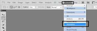
1: Open photoshop. Go to "window" and press on "animation"

2: Place your video clip you want to make gif from.

3: Choose starting point from the button on circle and press "Set start of work area"
4: Choose ending point and press "Set end of work area"

5: Your video should be cropped by now.
6: Go to File -> Save for Web & Devices
7: Your video should load up. Set "GIF" on right top.
8: If you want your GIF to loop, change looping from "Once" to "Forever" on low right side, just above "Done" button.

9: SAVE!
10: Upload :)


1: Open photoshop. Go to "window" and press on "animation"

2: Place your video clip you want to make gif from.
3: Choose starting point from the button on circle and press "Set start of work area"
4: Choose ending point and press "Set end of work area"

5: Your video should be cropped by now.
6: Go to File -> Save for Web & Devices
7: Your video should load up. Set "GIF" on right top.
8: If you want your GIF to loop, change looping from "Once" to "Forever" on low right side, just above "Done" button.

9: SAVE!
10: Upload :)
Saturday, 7 January 2012
Advert Infos

-Same font used throughout the advert
-Combined two colours of fonts - red and black. Good contrast.
-Important things like name, or when CD comes out is enlarged.
-Good photos, showing whole face. Also, good photoshop skills when editing her second photo.
-White background works well with her hair and skin colour. She doesn't look outstanding from advert. I would say that she "blends in".

-Good, clear sans serif font places across the photo on the centre.
-Photo works well with name of the album, which is "Empire". The photo is showing a card "King", who is always the most powerful character in the castle and rules whole empire.
-Shows clearly when album comes out, and same as Christina Aguiera's advert - uses contrasting black and red font.
- Website and logos are the smallest words we can see on the bottom of advert.
Thursday, 5 January 2012
Making of "Nevermind" - by Nirvana.

I looked up at Ada's blog and realised that she is writing about my top favorite album ever - "Nevermind". It is also one of the most recognizable album, mostly because of great background picture.
The picture is showing a naked child swimming underwater towards a dollar note hooked to fishing rope. In my quick analysis, I could describe that as connection to a powerless men risking his life for a money which is just a trap from people "above humanity", like department or mafia.
You can actually watch a producer talking about the whole idea:
Tuesday, 3 January 2012
DO's and DON"Ts for my digipak
DO's:
-Use a clear font
-Use appropriate font size and images
-Use clear and in focus photos
-Rule of Thirds!
-Follow conventions of the colour
-Use appropriate industry logos
-Remember - genre conventions!
DON'T
-Stretch images - this will make them out of focus
-Use layer styles
-Use unnecessary effect. Remember that effects must suit genre.
-Place text across artist's face
-Use font "because you like it"
-Use a clear font
-Use appropriate font size and images
-Use clear and in focus photos
-Rule of Thirds!
-Follow conventions of the colour
-Use appropriate industry logos
-Remember - genre conventions!
DON'T
-Stretch images - this will make them out of focus
-Use layer styles
-Use unnecessary effect. Remember that effects must suit genre.
-Place text across artist's face
-Use font "because you like it"
Thursday, 22 December 2011
Album name change
We have officially decided to change our name album from "BRAINWASH" to "DISCO NEVER DIES", and also choose the font, which is "Disco inferno"
You can see all of that on recording girls did while I was ill :( thanks! :*
You can see all of that on recording girls did while I was ill :( thanks! :*
Monday, 19 December 2011
Rule of thirds
"The rule states that an image should be imagined as divided into nine equal parts by two equally-spaced horizontal lines and two equally-spaced vertical lines, and that important compositional elements should be placed along these lines or their intersections."
That means most important elements must stand out and should be placed on the lines, or where they meet. The reason for that is much greater attraction to those points.
Wednesday, 14 December 2011
Some new ideas
While I am still away. girls looked up and found some new graphics we could use. Those are just some splashes that could be made in graphic department. They could not be directly connected with the idea of vinyl and electropop, however this could be a good way for recognition in future albums.


We have also agreed on colours: those will be Yellow, Blue and Red, in addition of black. Of course, everyone can use different tone.
Interesting CD covers
 |
| I think we could agree that background is just fantastic, and photo well placed. |
 |
| We like the shadow/effect because it is colourful and can obtain all three main colours. |
 |
| We like the different colours of the lights and the sparks shooting out to reveal a sparlking effect. |
 |
| We like the use of lights to spell out the title. |
Sunday, 11 December 2011
CD covers - electropop genre
LMFAO- Sorry for Party Rocking

 Same artist, just a different album. And again, the same font, just colours used are changed for very bright. It's actually hard to concentrate on font, as it's very disturbing. The background is showing artists hold on fan's hands. Nice and clear, no problems with describing for who is this album and what genre it is.
DJ Kaskade- Strobelite Seduction
 This album has a very stroking lights around going across the CD cover, which co-operate with the serif font used. Colours are very successful and well matched with the background, and even through you can see many colour tones, he only used four (purple, black, yellow and white). Picture taken is very good, placed on the centre/left. The problem with this picture is that you can only see half of his face. This is not good for someone like me who is promoting a debut album.

Two main colours used are purple and black. The font used for their name is very bright and energetic, just like Electropop is like. On top of "LMFAO" you can see their faces drawn, which makes their logo more recognizable. They used girl's body as a background for a album name. You could probably describe it as a tattoo. You can clearly see their faces, half naked girl with her arms up are characteristic for a dancing and partying. I think target audience is quite clear, somewhere about 16-24 years old.
LMFAO- Party Rocking
 Same artist, just a different album. And again, the same font, just colours used are changed for very bright. It's actually hard to concentrate on font, as it's very disturbing. The background is showing artists hold on fan's hands. Nice and clear, no problems with describing for who is this album and what genre it is.

Font use: our possibilities
While I must've go away for few days, girls decided to call our album "BRAINWASH".
As our audience are people aged 14-26, they aren't really capable to decide what to think and get in the right path, and many artists these days are fully using it. They often say and give a secret messages in their songs and "BRAINWASH" young people. Of course, it's all just for their own profit...

Few possible fonts we could use.
As our audience are people aged 14-26, they aren't really capable to decide what to think and get in the right path, and many artists these days are fully using it. They often say and give a secret messages in their songs and "BRAINWASH" young people. Of course, it's all just for their own profit...
Few possible fonts we could use.
Subscribe to:
Posts (Atom)