Showing posts with label Ada Chyrowska. Show all posts
Showing posts with label Ada Chyrowska. Show all posts
Sunday, 29 January 2012

Wednesday, 25 January 2012
EVALUATION Q4
Receiving a feedback was an important stage, during the making of the video as well as when it become a finished product. It allowed me to see my work from different angles and perspectives. I felt really proud when someone spotted the aim of the music video and the genre conventions really appealed to them. For my feedback, I asked people who would be interested and attracted to this music type. I have also asked my teacher, who knows the genre conventions, therefore his feedback was really useful and honest, because the comments he made very practical.
the most helpful thing about this feedback is the part about projector, it was really nice to hear from someone who would be attracted to fun and energetic things. I felt like we did the right thing, because the video actually works (!) and appeals to our target audience. Through this I know that the use of projector developed our idea even further so that the fact that we're trying to promote a new artist is much more clearer that without the base track.
Dan's comment about ' a lot of pace' really made me realise that the video has a fun and upbeat feel, we aimed to do so but hearing it from someone makes me realise that we've been successful. The fast pace appeals to our target audience (16-25year old). He also said that the projector covered Robert's face, but that he has put so much into his performance that we don't get distracted by the light. This made me see my video in a completely different angle, if Robert's performance would be boring and still the video would look completely different. Because of the lively performance, the video became more visually interesting, rather than is Robert was standing still, and the projected lights would cover his face, this would seem really pointless and random. halfway through sentence. He also said that there was one shot where we cut halfway through the sentence. That is because of Robert's lipsync, none of the videos we had matched the singing, so we used two that did-one started off right but then went out of tune, the other picked up roughly where the first went wrong. unfortunately we had no other choice, and we didn't want the video to feel as it's not on time with the lyrics, so we had to cut through the sentence.


My teacher said that out video stands out from different pop videos and gives an emphasis on teenage lifestyles. He asked be if the ‘coolness’ would be carried on throughout the other videos, and if I made another video for Mic CTRL, would I carry on with the same values and energy? He also said that one thing about the video he didn’t like is that every part of it has something colourful, except for the dance studio!
This made me think about the artist and his album as an real product. I feel that making another video, which follows eg Laura Mulvey’s theory about ‘passive female’ would be putting all our hard work in the bin. We wanted to create artist who stands out from the commercial pop videos, someone who has different values, that’s why he can be a real role model for teenagers. The next videos would also represent teenagers in a positive way, the other song might give insight into life with someone struggling with problems, or someone who’s successful, happy. The artist might be taking part in the video and follow the narrative, rather than being a narrator. The next thing I’ve realized after this feedback is that the dance studio really does not fit the rest of the video, although dancing is very energetic. We made a mistake in costume, we couldn’t really find a colourful studio, but the easiest thing would be having the dancers in colourful costumes, which would make them stand out and therefore the video would become even more lively in this part. The skateboard scene also isn’t colourful, but there was nothing we could do, however my teacher said that the skateboarder is more energetic because of the movement, quick cuts and ‘in your face’ shots.

This feedback has helped me to understand that bright colours are not just conventional for our genre, but also they're eye-catchy witch will get the most attention e.g. if it was an advert in a magazine, even though when people may just flick through the pages, the specific colour scheme and effect will maybe remind them of something they've seen before (e.g. the video or the album itself). People will assiociate the specific image with our artist. I like that part 'the font matches it's theme', because that's what we've been aiming to do. I also learned that 'the artist is well shown', which I seemed to do automatically, having in mind that I'm trying to promote a new artist. i think that having so many pictures of the artist has helped me to achieve a higher impact when it comes to knowing the artist, the audience know who they're listening to, and showing the photos helps us to create his style and brand, which links to the target audience.
Most important thing about this feedback is that is learned me that females (16-25) are able to identify with this video, it’s easier with males because they’re might be attracted to the costume and be inspired by the artist’s style. But females might be inspired by the painting and dancing, which might be activities that they might be part of. This video might really inspire them, because they’re doing something similar, or because they want to start it. I haven’t realized it before this feedback, but this video appeals to girls as much as it does to boys. Girls can be inspired it in a way boys wouldn’t be and vice versa. I feel that this is a really important aspect, at the end of the day one of our aims was inspire, but we didn’t really think that inspiration can come in many different forms, and this is one of them

This feedback shows that young males such as Asilhan (17) would be attracted to the costume that out artist was wearing ‘costume matched the song’, I feel like this is a really good example because this is a feedback from the actual audience who would listen to Mic CTRL, and this is what we tried to do. Again it shows that our video would appeal to our target audience, and it does which I feel proud of because it makes our video really successful. The feedback about the ancillary work really shows my weak point- the ‘out now’ is the part that I struggled with the most, even now I’m not really sure about it. I tried many different colours, for instance black, which stood out but looked really random and I felt like does not match the rest of the advert. I decided to go with purple/blue and yellow, because that’s the colour scheme we chose and I felt that it matches the rest of the advert, but for some reason does not stand out as much as it could. I also realized how successful our font is, it links to the Calvin Harris’ Ready For The Weekend album, and the font gives our album and electro pop feel. I like the fact that the costume was really noticeable and our audience clearly is able to identify it.
During one of my lessons I also got a feedback from my teacher, unfortunately I didn’t record it but it was really helpful, that’s why I remember it until now.
My teacher said that out video stands out from different pop videos and gives an emphasis on teenage lifestyles. He asked be if the ‘coolness’ would be carried on throughout the other videos, and if I made another video for Mic CTRL, would I carry on with the same values and energy? He also said that one thing about the video he didn’t like is that every part of it has something colourful, except for the dance studio!
This made me think about the artist and his album as an real product. I feel that making another video, which follows eg Laura Mulvey’s theory about ‘passive female’ would be putting all our hard work in the bin. We wanted to create artist who stands out from the commercial pop videos, someone who has different values, that’s why he can be a real role model for teenagers. The next videos would also represent teenagers in a positive way, the other song might give insight into life with someone struggling with problems, or someone who’s successful, happy. The artist might be taking part in the video and follow the narrative, rather than being a narrator. The next thing I’ve realized after this feedback is that the dance studio really does not fit the rest of the video, although dancing is very energetic. We made a mistake in costume, we couldn’t really find a colourful studio, but the easiest thing would be having the dancers in colourful costumes, which would make them stand out and therefore the video would become even more lively in this part. The skateboard scene also isn’t colourful, but there was nothing we could do, however my teacher said that the skateboarder is more energetic because of the movement, quick cuts and ‘in your face’ shots.
Tuesday, 24 January 2012
EVALUATION Q3
I used different media technologies to construct my research, planning and evaluation stages.


PRODUCTION
brand new state of art video cameras with memory cards, we had to remind ourselves how to use it and take care of it, as it turned out we still remembered from AS, just needed a bit of refreshing.

The memory card was really useful, as it had so much space we could use it to have our back-up clips in case something would go wrong with the video drive. This also allowed us to view the clips on two computers and split into two (two people were using the hard drive and the other two the memory cards) to go through all the clips and decide which one we could use.
We didn't have any problems with the camera, it wasn't too big and heavy so we could easily carry it when filming in different locations. We used acetate, which we put over the camera lens in the glitter and painting scene, to make sure nothing gets on the lens.
Internet, such as DaFont

Photoshop

I used Photoshop to edit my ancillary photos, the editing helped me to get my images stronger and powerful. I was able to add contrast and brightness, change the levels, and colour balance. I could also use it to overlay three photos together for a more appealing effect. This is I believe what made everyone's digipak and advert different-even though we had the same photos and could even use the same one, everyone edited them in a different way. I had to learn how to use the gradient tool, to create the effect I wanted.


I used my digital camera for taking photos 'behind the scenes' as well as during the photo shoot. The good quality allowed me to follow my 'do's and don'ts' because my photos weren't pixilated.

a flip camera or a phone to record the feedback from other students and teachers. it allowed us to post the videos onto Blogger straight away. through this I knew I had it saved and could re-watch it anytime to relate to the feedback in a quicker and more technical way.

and finally: Final Cut Pro

this is a screen recording of when we were adding the effect to out video:
RESEARCH AND PLANNING
- BLOGGER was essential part of my research, because it helped me to get all the information together. It worked as my notebook, everything I found about music videos I could make a post about it so that I can come back to it anytime, I felt like I'm carrying a diary and every information could be easily found.

- Internet, including YouTube to find out about different music videos. It helped me to find the particular video clip from a particularr genre I wanted and it improved my analitical skills as I was able to analyse music videos from different genres including rock, r'n'b, hiphop. YouTube allowed me to find songs by searching the title or genre. I also used Wikipedia to find detailed descriptions about the video clip itself or the music genre.

- Last FM has helped me with my audience research; 'recent top listeners' allowed me to see the profile of real fans of electro-pop, I also thought of what else they listen to. This allowed me to think of a more specific target audience, what else they listen to, what specific songs do they like. Through this I could relate to them more, I knew exactly who my target audience is.


brand new state of art video cameras with memory cards, we had to remind ourselves how to use it and take care of it, as it turned out we still remembered from AS, just needed a bit of refreshing.
The memory card was really useful, as it had so much space we could use it to have our back-up clips in case something would go wrong with the video drive. This also allowed us to view the clips on two computers and split into two (two people were using the hard drive and the other two the memory cards) to go through all the clips and decide which one we could use.
We didn't have any problems with the camera, it wasn't too big and heavy so we could easily carry it when filming in different locations. We used acetate, which we put over the camera lens in the glitter and painting scene, to make sure nothing gets on the lens.
Internet, such as DaFont

which has enabled me to choose from so many variations of fonts, this website is part of what made my digipak and advertisment successful. Font is very important part of work, and the font I used links to our genre of music and meets expectations of our target audience. Without it, the ancillary work wouldn't have the same effect.
Photoshop
I used Photoshop to edit my ancillary photos, the editing helped me to get my images stronger and powerful. I was able to add contrast and brightness, change the levels, and colour balance. I could also use it to overlay three photos together for a more appealing effect. This is I believe what made everyone's digipak and advert different-even though we had the same photos and could even use the same one, everyone edited them in a different way. I had to learn how to use the gradient tool, to create the effect I wanted.
(drag across)


I used my digital camera for taking photos 'behind the scenes' as well as during the photo shoot. The good quality allowed me to follow my 'do's and don'ts' because my photos weren't pixilated.
a flip camera or a phone to record the feedback from other students and teachers. it allowed us to post the videos onto Blogger straight away. through this I knew I had it saved and could re-watch it anytime to relate to the feedback in a quicker and more technical way.
and finally: Final Cut Pro
which we used for editing our music video and which I am using now for some of the parts of my evaluation. We've also learned how to change the colour balance and this is what created a warm effect on our video.
it enables me to view and link footage together to create a consistent series of narratives, base tracks, lipsynching, speeding up and slowing down footage, adding filters and effects. These are very essential, the editing is an important part of the production. Through fast editing, quick cuts, and transitions we were able to produce an upbeat and energetic video which linked to our genre.
it enables me to view and link footage together to create a consistent series of narratives, base tracks, lipsynching, speeding up and slowing down footage, adding filters and effects. These are very essential, the editing is an important part of the production. Through fast editing, quick cuts, and transitions we were able to produce an upbeat and energetic video which linked to our genre.
this is a screen recording of when we were adding the effect to out video:
Monday, 23 January 2012
EVALUATION- Q2
The biggest aim of both ancillary work and our video is trying to promote the artist. Throughout we used some factors that we kept the same in three pieces.
I’m really sorry about the quality of the sound, I haven’t realized it was so loud until I rewatched the video. If it’s to lound to hear, here’s the main summary of the points I made:
-COSTUME: fashionable, striking red jumper, which links to his skate style. Consistency of the cotume throughout vieo, digipak, advert. Many males would be attracted to the costume, or is something they woud wear (another way to appeal to them).
-FONT: used the same font in digipak and advert (audience can link the two easily). Font link to the disco theme, which links to our genre.
-COLOUR SCHEME: cosistency in colours, bright=lively and exciting feel.
The video contains many colourful aspects such as:
• Robert’s red jumper=stands out, more lively music video
• Projector=colourful bright and in your face.
• Paining scene.
-EFFECT
Clear link between advert and digipak. Bright colours bring our attention. Electro pop is is assiciated with lights, DJ's and parties therefore the bright effect links to the conventions of the genre.
-PROP
The hat promotes his style and image we wanted to create. The hat represents the playful mood of the artist.
-COSTUME: fashionable, striking red jumper, which links to his skate style. Consistency of the cotume throughout vieo, digipak, advert. Many males would be attracted to the costume, or is something they woud wear (another way to appeal to them).
-FONT: used the same font in digipak and advert (audience can link the two easily). Font link to the disco theme, which links to our genre.
-COLOUR SCHEME: cosistency in colours, bright=lively and exciting feel.
The video contains many colourful aspects such as:
• Robert’s red jumper=stands out, more lively music video
• Projector=colourful bright and in your face.
• Paining scene.
-EFFECT
Clear link between advert and digipak. Bright colours bring our attention. Electro pop is is assiciated with lights, DJ's and parties therefore the bright effect links to the conventions of the genre.
-PROP
The hat promotes his style and image we wanted to create. The hat represents the playful mood of the artist.
Sunday, 22 January 2012
EVALUATION Q1
Our music video is made for Electro Pop / Dance genre of music. We aimed to follow genre conventions at every stage from planning to creating a digi pack. Our main influences were Calvin Harris himself, David Guetta, Olly Murs and Example. From each, we got an inspiration to create a new artist- Mic CTRL. Conventions are accepted standards and forms, the electro pop explores themes of bright lights, fun, and visual elements.
Our video also follows the conventions of music videos from different genre of music, this includes Carol Vernallis, who's theory covers what the good music videos should have.
-We have made a master shot also called a base track that is repeted to give the video a clear structure. Each verse had a different base track, which changes on the beat, we thought that quick changes between shots will also make the video more lively and energetic.
 |
| base track shots |
-we used jump cuts, which not only shortens the time but makes the video more exciting and striking because it looks like a lot more is happening. The intended audience (16-25) will be attracted to anything interactive, rather that still and boring, especially with such an upbeat song. The making of this shot took us around 20 minutes and it was shortened to 3 seconds. Even though the shot itself if still, there is a lot going on such as fast movement and makes the jump cut seem like an animation. It relates to the conventions of our music video because of the bright colours and movement and makes the video seem more energetic.
-and the camera moves in time with music, which makes the video 'flow', and comes away from the idea of a repetitive, still image. The movement creates a more energetic feel of the video, which is what we aimed for.
Linking our video to Goodwin's theory I would say we've produced a mixture between an amplification and a disjuncture. Our video takes the basic lyrics of the song (about relationships) and uses them to illustrate the passion and love that teenagers feel for their hobbies and creative pursuits. This is amplifying the basic theme of the lyrics (as per Goodwin’s theory) but is also providing a degree of disjuncture as these are meanings created and made by our video.
The lyrics state that that it's a love song-'I feel so close to you right now', 'your love pours down on me', 'there is no stopping us right now'. By watching our video it's clearly not a love song, however there may be some aspects that might state so.
E.g. Robert's singing 'i feel so close to you right now' and there's a transition with Evie blowing the glitter, which may make it seem as if he's singing to her.

The next important link is that the singer often looks at the camera and therefore we see him both as an artist and a narrator. Goodwin states that the performance involves the viewers at home. I think that through this they feel part of the video and they get the sense of feeling it was made for them. In our video this was really useful as Robert gives a really funny and energetic performance in front of the projector, looking directly at the camera, that’s why this helps us to promote him even more, by looking into the camera the audience is more engaged with the video and see Robert as energetic and happy, that’s why it’s they want to be part of it, and I feel like this appeals to them even more.
Goodwin also states that pop video rely on repetition. The video repeats images the way the song repeats choruses or lines. The intertextuality help the viewers become familiar with the genre and certain repetitions, which then helps them to be familiar with the genre. For instance the repetition of the projector on Robert helps us to link to the genre, we get a colourful and bright images many times and that’s what electro pop is about.
Goodwin also states that pop video rely on repetition. The video repeats images the way the song repeats choruses or lines. The intertextuality help the viewers become familiar with the genre and certain repetitions, which then helps them to be familiar with the genre. For instance the repetition of the projector on Robert helps us to link to the genre, we get a colourful and bright images many times and that’s what electro pop is about.
Camera work:
Olly Murs: Heart Skips a Beat.
This really showed us and helped to understand Vernallis' theory. A lot of movement is involved, which fits with the beat and makes the video more exciting, rather than still, used in movies to tell the story, not to promote artist. Similary to our video, My Heart Skips A Beat also seems energetic and fun, that's why it was a big influence to us.
We also liked the editing in this video, especially the quick cuts when the beat changes
So we used it in our video, which I feel created a stronger impact on the audience, because so much is going on and it changes really quickly. This again links back to the conventions: bright, striking, moving, fast. This also creates the idea of fun and more importantly links to the target audience of our genre. :
This video has also influenced us when it comes to camera shots. The video included shots of skateboarder and we liked how different shots are used, for example:

Analysing these shots and then using them helped us create a visually striking image, which seems to have a greater impact on the audience, this combined with quick cuts made out video more exciting and moving.
We also decided to use the projector. While producing an extra base track, we thought of using the projector, like in Calvin Harris ft Rihanna- We found love. We found a good movie on YouTube, witch colourful writing and images that frequently change. This worked out really well, and made our video even more colourful and fun. I also think this effect works well in the orginal video 'we found love', the projections such as clouds and storm, might connote feelings such as chaos or peace.
We Found Love:

Editing:
The biggest influence was Black Eyed Peas- I gotta a feeling. We loved the slow motion edit, when the song is fast It creates a powerful effect and we used in when the dancers jump, then suddenly the pace is back to normal on the beat. We also used slow motion when the beat breaks for the first time, it's the scene where Evie blows glitter. I feel as if this is a break in a fast edited video, however the slow motion looks effective; it goes to the beat, however is still colourful and bright because of the glitter.The jump however isn't 'bright'- dancers aren't wearing anything colourful and the studio itself look really dull. But I think that the slow motion of the movement created a powerful impact, especially when we're looking out for the drop when the beat changes, and the jump is brought back to normal pace.
our video:
While producing an ancillary work I looked at artists of closer genre, including electro pop such as Kaskade and David Guetta, to look at colour and font use, which is conventional for the genre of our genre of music.
Album Cover on Prezi
In order to create a powerful piece of work, we looked at the conventions of already existent electro pop artists, including Calvin Harris.
 The first studio album called 'ready for the weekend' has a party feel, the woman on the photo is attractive, we can't see her eyes because she's wearing big goggles, which seem to have a repetition of circles, circles link to CD's and vinyls which DJ's use. Electro Pop seems to be a type of music which sets the audience in a good mood, before the party, might be even heard at them. This is what we tried to have in mind while producing our work.
The conversions we used are similar to Calvin Harris'- the album should create an exciting feeling, just as electro-pop music itself. The bright colours should strike the audience (16-25yrs old), who are attracted to catchy colours and CD albums, especially to listen before going out, or to inspire them to produce their own music.
As well as following the genre conventions for our music genre, we also wanted to challenge some ideas and stereotypes. Teenagers are usually portrayed as lazy, often associated with parties and alcohol. In our video we wanted to challenge this and show youths in a good light, as talented and valuable, who have passions and ambitions. Also, Laura Mulvey's theory states that females are portrayed as passive. We also wanted to challange that, every female in the video is dressed and isn't showing body, we used make up but not in a provocative way.
The dancers are actually wearing full costume, unlike some videos such as Britney Spears- 3

I also think that we varied conventions of a music video by simply giving an insight into a teenage lifestyle and creativity, which isn't usually found in a pop/dance genre of music.
Wednesday, 11 January 2012


Tuesday, 10 January 2012
best pictures for the front cover
Here are shots I chose to consider for my album cover.


I first used this, but I got a feedback from my teacher who said it's not as effective because Robert doesn't look at the camera and we don't know where he's looking.

..So I chose this one, which after adding the effect looked successful:
 I also think it's successful it because it follows the rule of thirds, which to be honest I spotted after choosing it (I guess I automatically did it anyway):

How do you make gifs
I first used this, but I got a feedback from my teacher who said it's not as effective because Robert doesn't look at the camera and we don't know where he's looking.

..So I chose this one, which after adding the effect looked successful:

How do you make gifs
photo shoot
We have taken the photo shoot in a photography studio, this way we got a consistent white background, which made it easy to crop Robert out (we didn't want any location on the album). We used lighting, so the photos will be more in focus and the contrast would be strong. Over all I am really happy with the photos, there are so many to choose from. We also used a fish-eye lens, which gave an humorous feeling, again linking to the style of the artist. This is the contact sheet of some photos we had (overall we had over 200!):


Free gif maker
Thursday, 5 January 2012
photoshop effect
I just discovered something really helpful ! I got the practise picture of Robert that I used for my practise album cover and I played with it on Photoshop to see what I how I can edit it in order to use it as my real album cover. I went back to the photoshop tutorial I used before (the one with smoke- here's the link if you don't remember-http://www.youtube.com/watch?v=QssJB-DlUd0&feature=player_embedded )
I did the same thing, but using the photo and I actually got a really good result that I liked !
Stage 1: new layer


I did the same thing, but using the photo and I actually got a really good result that I liked !
Stage 1: new layer

Stage 2: Gradient effect, dragging the line across, overlaying the layers.

Stage 3: Duplicating the layers. With the smoke, it was more aggressive, here I think works really well considering the fact the image was very light before, here it stands out more and that's what i tried to get.

My outcome:

I'm happy because I'm on the right tract to get the effect I want. I will still play with the colours and in a real photo use the colours we agreed on. Also, I want the background to be white, so I'll work on that too.
We plan on taking the photoshoot over the weekend !


Wednesday, 4 January 2012
advert practive (first edit)
I've also done the advert. I will use the same picture I used for the album cover, so that audience will be familiar with the image and will link the two straight away.


The only think I want to work on is the font, I don't like how its overwhelming and looks like 'too much'. I will also do research the information contained on the advert when I get home. This will help me to make up my mind about what my advert would have.
I will also have the website address and I want to have social networking sites' logos on the bottom.
Dan's feedback:
-layout (out now-a bit too low)
-different font for the artist and the information.
-include more info.
front cover- first edit

This is a rough/ practise edit of my album cover. I used a picture of Robert we took before, we still have to wait form him to come back from holidays, but when he does we will do the photoshoot and use the real pictures.
I wanted to get the idea of how to make the effects I want and if it will look effective overall.
There are things I will improve:
-more tracks
-better picture
-effect of the picture needs to be stronger to stand out more
- photograph the vinyl myself, maybe use a different combination/ placement.
I asked my teacher Dan for the feedback and he suggested:
-to use a different font for tracklist (more exciting!)
-fill the name of artist and album name in front cover more so it fills the space (by moving it and/or making it bigger).
-maybe use another picture of Robert on the back?
-colours need to be brighter to stand out (the front)
-maybe try and colour in the font on the front ?
-maybe try and colour in the font on the front ?
Tuesday, 3 January 2012
creating a digipack: DO's and DON'T's


* images that are streched or enlarged become pixelated and loose quality !!
eg:

Nirvana- 'Nevermind' album cover
Here Dave Grohl talks about their idea of the cover:
The making of Nirvana's "Nevermind" album cover


rule of thirds.
R U L E O F T H I R D S
"The rule states that an image should be imagined as divided into nine equal parts by two equally-spaced horizontal lines and two equally-spaced vertical lines, and that important compositional elements should be placed along these lines or their intersections."
Meaning that most important elements that stand out should be placed on the lines, or where they meet. This is because our eyes are attracted to these points the most.
It's said that these point create tension and energy from the viewer, over all it creates much more rewarding effect.

Tuesday, 27 December 2011
Amy Winehouse's billboard
Even during Xmas break I can't get away with media work:D I saw this advert promoting Amy Winehouse's album.


this is the billboard advert:

this is the new album called Lioness: Hidden Treasures
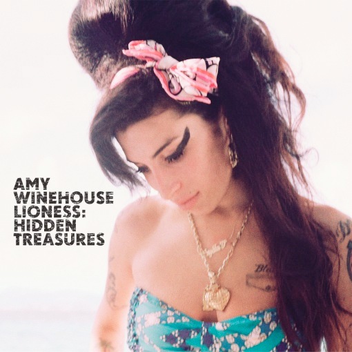
As you can see, there's not much of a difference between the advert and the actual CD. I think that works really well, I think it makes it simple, but appealing.
SIMILARITIES: The picture is the same, in the exactly the same place in both. There's a white background, the font is the same and is even placed in the same position- left center.
So the main difference really, is the format. album- a CD size, a billboard-... well, much bigger size and a rectangular, portrait form. There are two logos on the bottom, probably the record label. There isn't anything else on it, unless it's not seen (the billboard was quite high up). Maybe it if was in a magazine, it would contain more information e.g. the realise date or a website. But because it's a billboard, many people just have a quick look at it and automatically think 'oh, Amy Winehouse's new album'.
This is what I want my digipack to be- simple, but appealing. Without extra words, logos, symbols. Also, this CD was realised after Amy Winehouse's death, so the lack of words and graphic may be a way of a tribute to her.
Subscribe to:
Posts (Atom)