Showing posts with label Evie Patterson. Show all posts

Sunday, 29 January 2012

Finished blogging!


Thanks to all the media teachers for helping me through the process, and of course to the rest of my group! It surprises me that I'm not annoyed with the song, but I am with everyone else's! I am really pleased with the outcome of our music video and ancillary work, we worked really hard on them!
FIN!
 ❤ 


Evaluation (Extra): Screen on the green

This is the cinema we visited to watch our music video.
My sister used to manage this cinema, although now she manages the Aubin Cinema in Shoreditch. In her spare time she likes to make interesting videos, ranging from movies to short films. She is apart of Project Trident (www.projecttrident.com) who make videos such as these:

http://projecttrident.com/videos/tellisonEdith/ - Music Video

http://projecttrident.com/videos/purpleTeaser/ - Film

She starred in a music video for Hot Head Show - PAYLOAD, a narrative music video. (She is the blonde zoo keeper).


The video mostly contains animation and jump cuts, which fit with the theme as the music was a modern jazz/rock piece, so the beats would be more upbeat and jagged. They have included animation at the beginning, which our video didn't do, but may be put into consideration for next time. However this a narrative , telling a story, rather than our disjuncture video. Our artist is lip syncing and looking at the camera (one of Andrew Goodwin's points), and in this video the character has no lip sync and doesn't look directly at the camera. This contrasts because we are promoting our artist, whether this video is promoting the video itself, having a weird, interesting and humorous concept that would bring views to the music video, hoping that people would then search for other songs and videos by the same artist.

Final Music Video

Thursday, 26 January 2012

Evaluation: Q4

Q4. Analyse one or two comments that you received of the video, focusing on potential changes or improvements – how could/would you change your product in relation to this feedback? What have you learned about what your audience said about your products? 

Q4 Introduction
by: epatz


As you can see in the video, when the video finished there was a big cheer, so I would take that as positive feedback. The majority of people I talked to afterwards also had positive comments, so I would say that was a success!

I asked Erika what she thought of the video, and she spoke highly of the warm colours, which reflect our pop genre. The things that stood out for her was the glitter and the cool performer. Overall, she summed it up as 'awesome'. This was very positive, and her comments refer to key scenes of the glitter transition, the editing of the colour filter in all scenes to make the colours brighter and the performance of the artist which connected with the audience.

Hanifah's feedback was very enthusiastic and positive, having the pop projector background being a key aspect of the video which stood out. She said it was interesting, which was the intention we were going for, as our video was made to entertain viewers. Also the popular glitter scene was once again mentioned, which means that it must have had a strong influence. She summed it up as 'amazing', a description I can also agree with!


Max said that one of the strongest parts of the video was the glitter scene, which also left a good impression on other viewers. However, he picked up on a weakness, which was the piano playing. He said that the piano playing wasn't on the screen when it was meant to. Our vision was to have the piano disconnected with the music as it was showing a hobby, although this did not come across on screen. This would be something we could improve on, so we can film it again and perhaps having it playing in time with the music so viewers would be able to understand and connect with the playing.

Nick commented on the styling, which we did indeed take time thinking over and made sure it fit the genre and the video. He also picked up on one of our creative techniques of filming, the illusion of painting on the lens, which Nick thought was impressive. He said the performance of the artist was humorous, which is a good comment to make, as we tried to make the video as entertaining as possible. We wanted to create a fun, colourful theme to link with our genre.

This is what Nick said when I asked him for feedback for my ancillary work.
The improvements are understandable, for instance the letter correction should have been automatically detected. Considering that the improvements are minor, the overall impact of the ancillary work linked quite well, as it is fair to say that it reflects my video and its genre greatly, due to the colour scheme and styling.

Strengths of Ancillary work:
-Entertaining photos that represent the artist's personality
-Colour scheme through-out so there is a constant theme of electro-pop
-Silhoutte effect

Weaknesses of Ancillary work that can be improved:
-Minor mistakes (e.g. letter)
-Using same colour font on digipak and advert (even though they are from the same colour scheme)
-Clarity of logos/links
This is a print screen of our video on vimeo. There was a comment which commented on our use of colour, which is good as this was one of the key aspects of our video that represented our electro-pop genre.
Video Feedback. I asked my target audience of 16-25 year olds.

Strengths of video:
- Colours 
-Interesting ideas/concept
-Creative use of shots and editing (e.g. paint scene)
-Humorous impact

Weaknesses of video that could be improved:
-Piano scene could be filmed with more light  
-Piano could be edited along with music a bit more

Overall, getting feedback was very helpful and useful as it made me consider what I should improve and do better next time.

Wednesday, 25 January 2012

Evaluation: Question 3


Q.3 How did you use media technologies in the construction and research, planning and evaluation stages?


This is a Screen Recording using iShowU, showing how I made the duplicate layers and turned them into a colour effect using the gradient map. It is also possible by filter effects.

Evaluation: Question 2


Q2. How effective is the combination of your main product (video) and ancillary texts (digipak and advertisement)?

MIC CTRL

The main purpose of the Video, Digipak and advertisement is to promote a new artist. MIC CTRL is a singer/DJ in which his genre is Electro-pop. To portray this, the video contains bright colours throughout, and I have tried to capture the same colourful image by using some bright block colours for the Digipak. This conveys the genre of Electro-pop. To follow this, I also put a fun effect around the photos, which relates to how fun the video is, which I also wanted to represent the artist as so people would be more inclined to buy his music.

gif makergif maker

As you can see, there is a constant theme of bright colours, with fun effects which represent Electro-pop music. They mainly base around block colours.


Costume:
The link between the video, the Digipak and advertisement is that MIC CTRL is in the same outfit (including the famous/iconic hat which could perhaps become a logo), so when someone sees the advert, and perhaps come across the Digipak/advert, they can see that it is the same person. He is wearing a Red Letterman jacket, similar to the one Example wears. It is bright, colourful and fun, just like the overall theme of the music video. His overall image including jeans is cool, again the intention I wanted to bring to the music video. It relates to the Electro-pop genre as the music is just as colourful and upbeat as the videos, which is why we included lots of art themed content in the video, including glitter and paint. 

Colour Scheme:
I have kept the same colour scheme of blue, red, yellow and white, so when these colours are together it can be associated with MIC CTRL. Electro-pop is known for having bright colour schemes to match with its fast beats and pace, it is attractive and makes the viewer feel good.

Font:
The font is the same, (like the Artist Calvin Harris has a statement font) so that they can recognise the person in the picture, and look to the font which represents the artist, and therefore links together. I think our target audience will be attracted to them because of its bright, bold, block colours which stand out amongst the dark shade of blue. I did not want to make it too bright, because it wouldn’t be easy to read and might put people off.

Photos:
The photos I have chosen are engaging, exploring a fun 3D theme, which can also be seen in the music video including the paint scene, when the glitter is being blown towards the camera and the illusion of painting on the lens. It is modern and different, hopefully attracting viewers to buy the music. 

The video and ancillary products exposes the artist’s fun personality so that fans (aged 16-25) can relate to him more. I have set boundaries between being too spaced out and too crowded and followed the rule of thirds. This is so that the eyes are drawn to the information/pictures with ease, which makes it organised and people will be more willing to read/see them rather then being attracted to a collage of mess.

My ancillary work may not attract everyone, with some people only having specific taste in music and may not like the connotations of other genres. For example, a person who only likes Rock music may not like it as they might only like the dark themes Rock may connote. Electro-pop is fun and colourful, and have made sure that this is conveyed through my video and ancillary products by making it stand out from the rest of the genres.

Monday, 23 January 2012

Evaluation: Question One


Q1. In what ways does your media product use, develop or challenge forms and conventions of real media products?


Did you decide to challenge the conventions of the genre of video for some reason? Be specific and detailed.

In making our video, we shot lots of footage of young women so we were forced to consider how women are represented, women are commonly represented as sex objects:

Laura Mulvey’s theory shows how women are objectified and men only see their body parts. However, our video shows women succeeding in their hobbies and reflecting talent rather than their bodies. Examples of this include:

Female dancers who are enjoying compiling a dance sequence (with appropriate clothing!):


A female painter who accomplishes a work of art:


A female piano player creating music:


Hobbies are an unglamorous part of life, therefore it challenges conventions of women being portrayed the way men see them. It also shows that men don’t always have to be show offs; they can also have a music video without flaunting themselves at women and just be focused on music. Artists like Adele prove this as most of her songs reflect her bad relationships and her music have made her successful without getting too involved with media perception.

After filming, we discovered out of Andrew Goodwin's point about music video types, we would class our video as Disjuncture. This is because the lyrics to the song do not exactly link to what is on screen. For example, 'Feel So Close' may suggest that it is a love song between two people, however our video depicts love for hobbies and show certain people at what they do best, i.e. painting/dancing.   

Carol Vernallis made the point that the camera may move in time with the music, which can be seen in our video, when the camera pans around the piano, and when the camera moves up and down to the paint brushing on the canvas. Carol Vernallis' observations also include jump cuts, which we have included often in our music video, for instance, MIC CTRL in different places of the skate park and the movement of cups in the art room switching around. 

Also refer to ancillary products – how conventional is your digipak and advertisement?


I have included clear, attractive pictures, complete with graphic design and bright colour scheme to connote Electro-pop. The font of the album and advert is the same (Disco Inferno) so people can recognise the artist’s genre of Electro-pop. It stands out so that when on the shelves people would be more likely to see it. This relates to Calvin Harris' ancillary products, as there is a constant theme of yellow and black, with use of his own font through-out.
 I put a picture of the album cover onto the advertisement, so that viewers would know what the album looks like if they want to buy it in the shops or online. To help them with this, I have put logos of HMV and iTunes so they know where it is available. For more information, there is a website and Facebook address in the bottom right corner. This will keep potential fans up to date by using social media. By doing this, it is helping promote MIC CTRL and get more people to listen to his Electro-pop music.
   La Roux's ancillary products are similar, as she includes one large picture showing her iconic hair (like MIC CTRL's hat) as a bold statement. Her album comes with a promotional sticker, one that I could consider putting on my digipak. Her work is alligned in different ways, as her poster is centred and the back of her CD cover has artwork in the centre rather than a background with the text wrapped around it to create a square shape. This differs to the back of Calvin's CD as it is slanted to represent a modern feel.

ClipGrab & Mpeg4 Stream clip converting clips that I trimmed using Quicktime trimmer  in order to make the video for this question.
Using Final Cut Pro to edit the video, I also used it to add text.
Clips that I grabbed and imported into Final Cut Pro.

Sunday, 22 January 2012

Research: Literal Music Video / Bad lip reading


I originally found this video on a programme called 'Rude Tube'. I thought it was very witty how they changed the lyrics so that it matched what was on screen so it mocked the music video and made it humorous.


This Youtube channel turns music videos and makes new songs and replaces the original song in the music video with it so that it twists the representation of the Artist. One of these examples is Taylor Swift's 'Our Song', which twists her innocent personality to the opposite, by simply changing the lyrics and adding more of an urban edge to the song. Her music genre is pop/country/folk, so the genre has been vastly changed. They have edited it very well so that most of the lip sync is accurate, and adapted the song to it.


Here are both of the videos together, as you can see almost every clip is the same, with the same timing. It shows how much lyrics could change a viewer's impression of the Artist.

Friday, 13 January 2012

Market Research: Billboard advertisements

This is a gif I found of Cher that is similar to our glitter scene, only  using confetti, which we could have used.  It is more visible in daylight and less messy.


This is a billboard advertising Cher Lloyd's album 'Sticks and Stones' I saw in Shoreditch. It's huge size makes it hard to miss! The use of a white background and different colours makes the font stand out, and the use of colours and graphics e.g stars, hearts and swirls make it quite girly, which is the intention to portray Cher's pop music and personality. Although, the size itself makes it an attraction on its own!
This is the album the billboard is promoting.
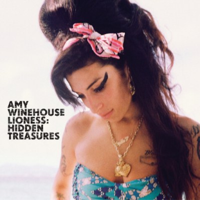
Again, this is another eye catching advertisement that I saw whilst on the bus for Amy Winehouse's album 'Lioness: Hidden Treastures'. The simplicity of the advert (and the brightness of the lighting) draws the eye to the picture of Amy. The white background also helps by making the black font and picture stand out. Also highlighted are Amy's accessories such as her bow and necklace in which pay tribute to her. The picture shows Amy on the right side, leaning towards the left, leaving space for the text next to it. 
Amy's album.

Market research: CD covers/Vinyl

I went to HMV previously to get inspiration for my Digipak. These are some examples I have found...

This Vinyl caught my eye because of the large centred image, and the  large centred font on the bottom.  Its simplistic, but that means the details are seen subtly, such as the graphic cartoons and the sticker on the top left corner.


I like Oh Land's album because of the graphic images that surround the centre image and repeats also on the back cover. This is a good idea as the attention is drawn to the middle of the circle. There is a curved theme, and is also seen through the title.

Britney's album 'Femme Fatale' is centred by an image of Britney. Plain, calm colours blend in with each other, however the silver title is not easy to read from afar. Britney's face and blonde hair draws the viewer to her facial expression, with her eyes looking straight forward to tempt them into buying the album.
This was an unusual album I came across, as there is no picture of the artist, nor  titles that stand out. The  probable intention was to grab the attention of the viewer by having an interesting  geometric pattern with bright block colours.

I liked the design of this album because it has a sleeve. The bottom layer includes an orange pattern/ images and the sleeve has cut out letters of the artist/album that reveal the pattern inside, while the outside is faded black. This will make the viewer wonder what the full images are like inside.
This interested me because the members of the band are wearing masks of the lead singer's face, which is humorous but made me wonder if they minded blocking their faces, since it would help their image more if they showed their faces a bit more. Although, the ambiguity might make the viewer want to look inside and get to know the artists by possible images on the inside of the album. The best thing about the album cover is that the title has a 3D effect, which makes it interesting to look at. I have seen this band live as they have supported Lady Gaga, and I think the overall effect of the album reflects how they perform live.
I liked this Chemical Brother's vinyl, because of the striking image. It makes the viewer feel as if they are underwater with this person, and that they are swimming deeper and deeper after diving in and discovering the Chemical Brother's title which is subtly placed at the bottom. This is so the journey starts from the top of the water to the bottom, and the eyes follow with it.
This is a CD stack in HMV I thought was quirky. I like how it resembles a  frequency/volume wave seen on radios.
I thought it was quite funny they have a whole corner dedicated to One Direction... :')

Wednesday, 11 January 2012

Digipak

Outside Panels
For the front cover, I have put a large picture of our Artist trying to grab the camera, as it is a fun image to look at and I am trying to promote his fun image. It could be mistaken to be slightly aggressive, but the softness from the effect behind and the fun block colours will soften the tone. The yellow and red effect expands the '3D' image, and relates to the yellow and red titles. The font is called 'Disco Inferno', and I have inserted a vinyl to portray the letter 'O' to give a feel of the artist's DJ side. At first the titles were smaller, but after being advised I made them bigger so that it is more clear to see. I chose a dark blue background, as I wanted the pictures to stand out, and yellow/red/white would have been too bright to use and therefore look unprofessional. It would also clash with the effect.
   The spine of the CD cover has the CD catalogue number, the artist name, album title and label logo. I put the Artist name in yellow so that it relates to the front title. I also put the lines of the spine in yellow to keep the colour flowing subtly. For the back, I put the writing in a lighter, sharper blue, so that the overall brightness and attention goes to the pictures to promote image. I didn't want any other brighter colour because it would look unprofessional and it would be a bit too bright to look at. I inserted a barcode in the corner (with the catalogue number on top), next to it the copyright symbol and information, including the producer and websites. The label logo is in the opposite corner. I tried to make it as discrete as possible so the eyes are drawn to the track list and picture.


Inside Panels
Inside, I have put a thank you message to people who made the album possible. Underneath, I have added information such as the song writing and photography. Next to the text, I have put the picture of MIC CTRL pointing so that the message becomes personal. I have repeated the same colour effect behind. The CD Holder has the circular border where the CD will go, (which will be coloured to represent the colour effect) and has a photo of the Artist looking down to reveal more of his famous hat. At first the photo was distorted/red, but I was advised that it looked a bit too much, and looked significant on its own being simplistic.

Advert
I started off with the picture of the Artist to be the main attraction, and have positioned it so that he is looking to the left of the frame, so that he is less intimidating and covers most of the right side. As he is looking to the left, I have put all information on the left so that he is looking at it, and mostly because that is where most of the space is. The MIC CTRL title is in blue and white, so it doesn't clash with the yellow and red and become too much. All other text is in white, originally in blue, so that they stand out more, and relate to the Artist's white accessories e.g. t-shirt. I like how the large photo (with repeated colour effect) is looking at the album and smiling, promoting a happy, fun image.
   Originally, I was going to have a similar photo to the front cover as the advert photo, but decided that it looked too aggressive, and perhaps there is a bit too much repetition, as the viewer wants to be interested by striking images, and overdoing it would look messy. I have included a bold title 'OUT NOW!' so the viewer knows the selling status of the album. Underneath, I have added quote ratings by critics, so that the viewer may be persuaded to buy the album through the comments made by professional critics. Along the bottom, I have put the label logo, and a HMV and iTunes logo, so people know where to buy the album from. In the bottom right corner, I have put MIC CTRL's website and facebook address, so that people can search for more information online.

Magazine Advertisements

I looked at some magazines including Q, Kerrang! and NME for inspiration for my magazine advertisement...

I was on Facebook on my iPhone and I noticed these pictures uploaded by The Maccabees... 
They found their advert outside the station!
These humorous photos shows a member of The Maccabees standing next to his own band advertisement on the underground. 
This is their advertisement, being a great example of the use of 'The rule of thirds'.
Using the grid on my iPhone, notice how everything from the centre object and the text is centred in the middle, leaving the plain parts on the side, so that the middle gets the most attention. This makes the viewer interested in the striking image as well as the title and information.
These are a collection of advertisments, being arranged either  by having the picture on the side with the text opposite, or with a centre image with the text above and below.

This ad shows Bruce from the bottom left corner, looking upwards and jointing to the right, with his guitar pointing to the main title which is in bold, and separates from the tour information on the side. The crowd are seen admiring Bruce, and all of them have their hands up, as if they are pointing to the information at the top.

These two adverts resemble each other, as both of their titles are at the top, main graphic design/image in the middle and tour information below, amongst company logos and website information. The two images are centred so that the viewer can see how it reflects the artist, and if it is appealing the viewer may want to attend a concert or search for their work.

Photoshoot

These are the images that we took in the photography studio. We will not be using the location in the pictures, mainly our Artist on a different background. These are the photos we took (total amount around 200), although I have chosen the best photos, short-listed for use in the album.


Kizoa slideshow: Outcome of Photoshoot - Slideshow

Behind the scenes photos:

Best Photos:
Shortlist photos:

Tuesday, 10 January 2012

Planning/Production of Ancillary products: CD cover draft


This is a draft following up from my mock up. I have used a photo from the photos taken while shopping for our Artist's costume. After the photoshoot I will be changing the picture, for quality reasons and because my teacher (Tony) said that he looks a bit shy and awkward, which is not the intention. He also said that the vinyl looks a bit mis-placed, as there is no effect on it and has no purpose, so I will be working on that. Tony commented on the copyright information on the back, in which was too 'visible', meaning that it is supposed to be small and subtle so it doesn't dominate the overall image. I have also noticed I haven't put the catalogue number in yet, and the background is a bit bland. I will take this in consideration and improve my digipak.

Monday, 19 December 2011

Planning Ancillary products - Mock up of digipak/Pitch

Draft 1

Draft 2 - Font changes to Disco Inferno and album name changes from Brainwash to Disco Never Dies.

Mock Up with colour - Red, Blue, Yellow

Pitch: We showed our designs to our teacher (Dan) and he said that our initial ideas were great. He especially liked the font for our front cover and the overall concept. The most important part is making sure that all of our digipaks contain some aspects such as graphic design, colours and track list, which we plan to do so we can go ahead and create our final digipak designs using photoshop.